Last week I started a series of posts around spot colors and Fiery. We covered the basics and factors that influence spot color accuracy, so let’s take it another step further with how to use Fiery Spot-On to manage and fine tune spot colors.
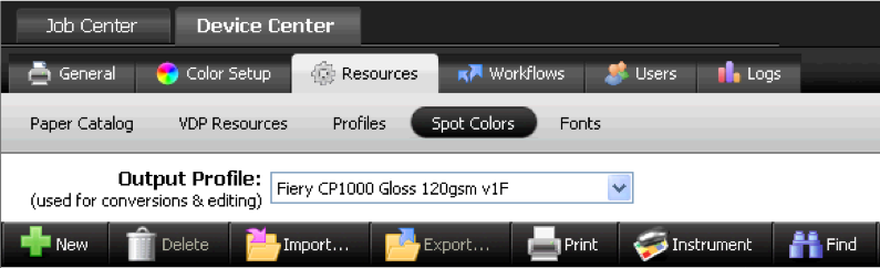
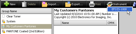
Fiery Spot-On is a tool that allows you to manage and adjust all the factory installed spot color tables, including adding your own. You can access Spot-On from Command WorkStation5 [Device Center > Resources > Spot Colors]
Things you can do with Spot-On:
• Manually fine-tune any spot color to ensure it prints exactly as needed.
• Create and maintain custom spot color groups that can be activated or deactivated as needed. These can contain tweaked spot colors that differ from the standard tables.
• Capture spot colors using an ES-1000 spectrophotometer.
• Create substitute colors that replace NON-spot colors by using RGB or CMYK values to identify them.
Fine tuning a spot color using Spot-On
If you have a particular spot color that is not being reproduced to your satisfaction, or you need to change a spot color for any reason, follow the steps below. You can use these steps as a basic procedure to fine tune any spot color or substitute color as mentioned in the subsequent sections of this blog.
First locate the spot color table where the original spot color is located. [Device Center > Resources > Spot Colors]. A popular spot color table is the PANTONE Coated or PANTONE Coated (2nd Edition) table, which is used by many applications and designers. Click on this table to expose the individual colors. If the PANTONE Coated (2nd Edition) table is not available on your Fiery it can be downloaded from http://www.efi.com/dm/pantone/. Instructions for installing are included with the download. The 2nd Edition table matches updated colors used by current versions of major applications.
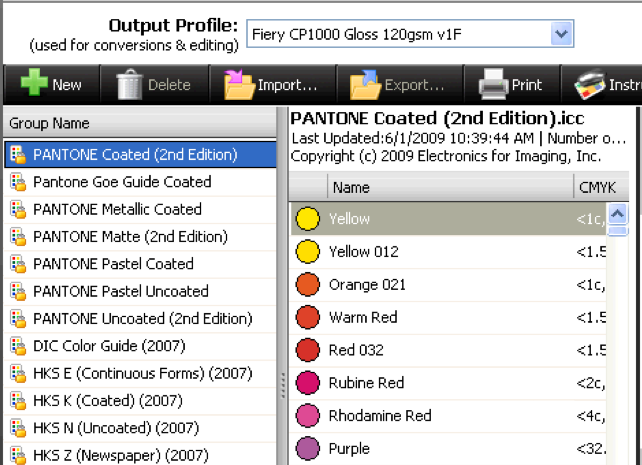
Since we will be printing search patterns to test our color we need to select the output profile that best suits the type of paper we are targeting for our newly changed spot color. Make sure to have this paper loaded on the engine. See previous screen shot.
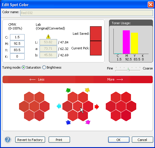
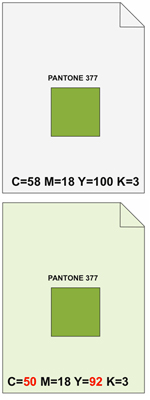
Locate your spot color and double click to bring up the search pattern window. In this example I am selecting Red 032. Explore the information and tools you have in the window below. The caution! symbol above the L*a*b* values indicates that this color it out of gamut for the printer and output profile selected. This means that the true color cannot be reproduced. When this occurs you still have the option of tweaking the color to arrive at the best or most acceptable color the printing conditions will allow. The CMYK values on the left represent the current selection. The initial values have been determined as “best fit” by the system. The saturation/brightness buttons change the way in which the search pattern responds. The Fine/Coarse slider increases the spacing between the search patches.
Click Print and follow the instructions to print the search pattern on the paper you have selected. This is important, as different papers will generate a different color response.
Using the printed output find the closest match to your desired color. The center/center square represents the current color and the center hexagon patch you see on screen. Once you have located the better match click on the hexagon patch that represents the position on the printed sheet.
If the color needs more fine tuning you can repeat these steps until the best match is achieved. Use the tools mentioned above to help you refine your search.
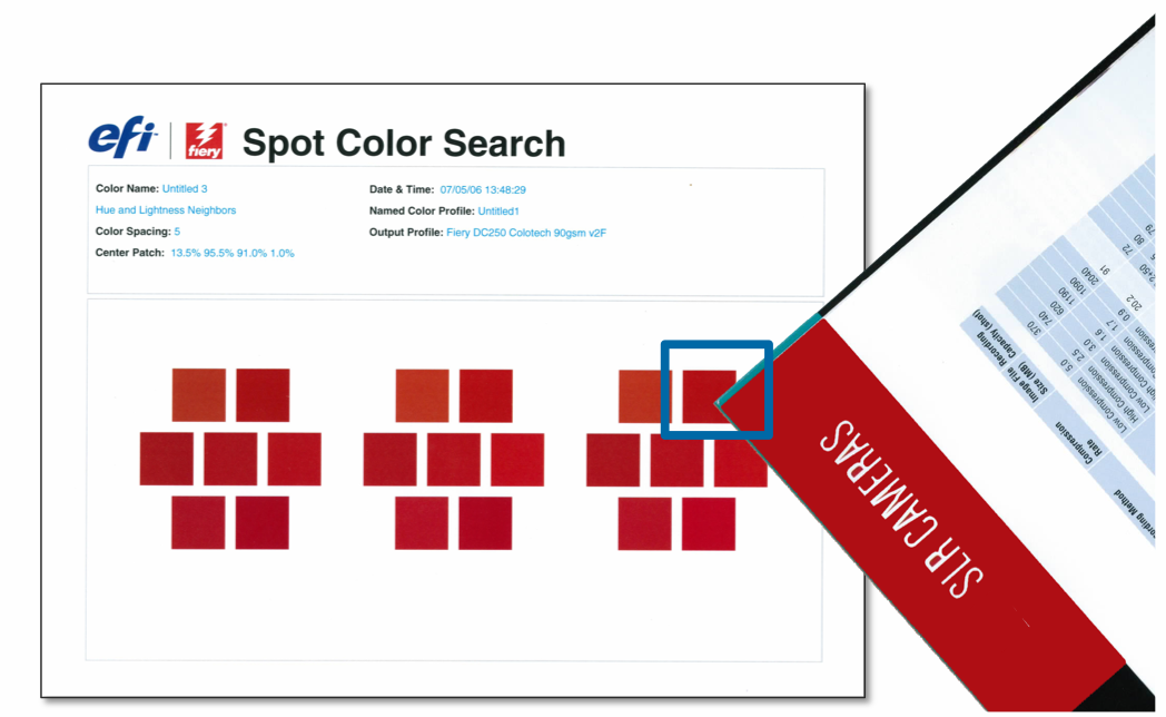
Once completed click “OK” at the bottom of the search pattern window and your spot color will now use the new CMYK values associated to the last center square you chose, for the specific stock and profile you selected.
Stay tuned for my next blog post: Creating and using a new spot color groups
Related Posts
-
 September 10, 2010
 -
 November 2, 2010
 -
 November 29, 2010
4 Comments
Comments are closed.
This doesn’t exactly show how to apply this color to a job. Just how to make a spot color which is easy… Getting it to apply to a job is what is not working for us.
Hello Andrew,
I’m glad that you find making a spot color using Spot-On is easy. We strive to build easy-to-use software with an intuitive interface.
In order to use this new spot color we need to know what your intent is. Here are 2 scenarios:
1) You are designing a new document using an application that is capable of defining spot colors, such as InDesign, and you need to define this new color as a spot color.
2) You have an existing PDF file that was created outside of your control and it is printing a color that appears to be a spot color incorrectly.
In the first scenario you must refer to the application’s documentation on how to define a spot color. however here are a couple of tips. Use the exact name (case sensitive) as you used in Spot-On. So if you called your color “purpLE” then you must use “purpLE” as the name in the application. Since a spot color defines a solid ink there is no need to use CMYK or RGB values in the application, however it is advisable to provide an alternate color that will be used in the display for simplifying design. These alternate values are also used if printing this document on a press that does not have spot color simulation capabilities. Tip: If describing a purple color I will use green or red as the alternate values so that when I print the document I will know for sure if my spot color is working.
In the second case you need a tool to identify the color within the PDF file. Quite often people refer to CMYK or RGB colors as Spot colors when in fact they are not. Acrobat with Enfocus Pitstop is a handy tool for identifying the nature of an object to determine if it is a spot color. Another tool is the option on the Fiery called Graphic Arts Package, Premium Edition. This is a series of 10 high value tools for the graphic arts of which one is called PostFlight. This feature allows you to process a job which identifies all objects on the page in color codes to help in identifying the spot colors. This feature is available on most external Fiery servers, and is included with some. See your vendor for details and availability.
If it is determined that the color is not in fact a spot color you can still use Spot On to modify it to your liking. There is a sub feature called substitute color that can do this. I have a blog post in this series that covers substitute color.
If I have not identified your situation here please respond with more details so that I can address your specific question, or visit the Fiery forums and post your question there http://fieryforums.efi.com.
Best,
Malcolm Crawford
Senior Fiery Partner Alliance Technical Manager
EFI
I’m with Andrew. I understand where to find the colors, how to select them and how to calibrate the machine.
What I need to know is:
If I have a document sent to my Fiery for my Ricoh C7100 in black, but the job needs to print in PMS 199, how do I apply that color to the document and change it from the black it was built in to PMS 199 red?
It’s a super simple question but the on the digital side of printing, it seems to be impossible to do. I want to select a PMS color and print the document in the PMS color I selected. A lot of us have graphic departments that design in black due to the fact that most jobs are printed to plates. On the press, I can change by simply putting in whatever ink I need. I need the same functionality from the fiery. My frustration is off the charts. I always get the answer that was given to Andrew. It’s like an answer for a question I didn’t even ask.
So, in plain english:
I select a job from my fiery.
I notice the job was built and sent in black.
My fiery has the entire PMS swatch book.
How do I select a color and tell the fiery to print in the color I’ve selected?
Best,
John Kelley
Hello John,
The Fiery has a feature called 2-Color Print Mapping. It is part of the Graphic Arts Package, Premium edition and is included with the Premium Fiery for most digital printers (QX-100 Platform), and optional on the standard Pro80 Fiery Platform.
This feature allows you to map any two of the process color plates, such as C, M, Y, and in your case K, to any other color including any of the included Pantone PMS libraries.
You can check If your Fiery has the Graphic Arts Package, Premium edition (GAPPE) by looking in the Device Center from Command WorkStation, Under General>General Info. You will see it listed under Options/Packages List. If you see GAPPE listed then go into Device Center>Resources>Spot Colors, then select 2-Color Print Mapping. Leave the first color mapped to itself and then select Black for the second color, then choose a Pantone Library and then the specific color.
Once the 2-color print mapping is setup you can turn on the feature at the job level. Go into the Job Properties, select the Color tab, then check the 2-Color Print Mapping check box.
Alternatively if your Fiery does not have the GAPPE you still may be able to use the Substitute Color feature of the Spot On feature. This will depend on how the black channel is defined within your document. It may be defined as a spot color or simply “Black”. Since I don’t have the file I cannot advise further.
I hope this helps.
Best,
Malcolm Crawford
Senior Partner Alliance Technical Manager
EFI