Craig Frazier is an illustrating designer who has enjoyed a distinguished career since 1978. His corporate clients include Adobe, Boeing, Navigant and the USPS, to name a few, and he is a frequent contributor to business publications such as the Fortune, Harvard Business Review, NY Times and Time Magazine, among many others.
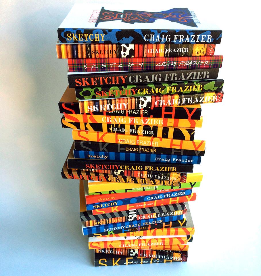
Recently, Craig collaborated with Xerox Corporation and Mohawk on the production of a new, limited-edition book entitled, Sketchy: Sketches from 1999-2014. The project highlights Frazier’s sketches created over a 15 year time period. We spoke with Craig to get his insights on Sketchy, the benefits of print, and why digital print is a critical technology for the creative community.

[Xerox] How does sketching play into your job?
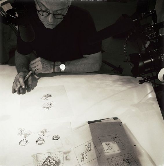
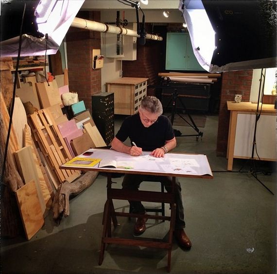
[Craig Frazier] I am a designer and an illustrator. Both jobs require a lot of sketching. It’s the necessary dancing around to find a solution to a problem. It’s rough, it’s hasty, it’s fuzzy—it’s not necessarily trustworthy. Behind every finished illustration or design is a trail of sketches—some good, and many not so good. But there is always at least one sketch that becomes the tipping point for the final solution. The one that says, “turn down this road, really, this could work.”
[Xerox] What did you take away from the experience of making the Sketchy book?
[Craig Frazier] I’ve learned it takes a long time to understand how you think. Sketching acts as the shorthand between problem and solution. In creating Sketchy, I wanted to provide a glimpse into the process of the brain. I wanted to find the unconscious moment when an idea was born and to trace the progression of its development. Interestingly, in compiling the book I found work from ten years ago that resembled work done last year. Unquestionably, there is an underlining stream of thought resident in the sketches.
[Xerox] Why didn’t you just create a web site or an app?
[Craig Frazier] Sketchy is all about an analog process – the marks that are made on paper—and to do it justice, it could only be produced in a medium that reflects that. Each page was carefully considered to create a moment that is worth holding in your hands. That is an experience that is, frankly, impossible to achieve online. The idea is to create a tangible object that serves as a document of time and has a covetable value. While I love today’s technology, swiping a screen is nothing like turning a page.
 I feel strongly that we are about to enter a period of online saturation where companies are going to have to get even more creative about how to make meaningful connections to their audiences. The problem is apparent—as saturation and distractions mount, penetration will only get more difficult. The name of the game is to stick around in someone’s mental or physical consciousness. For that reason, print is a fierce competitor – if it’s good. And there lies the challenge: creating materials that are relevant and aesthetically pleasing. Just producing print isn’t enough – witness our mailboxes every day – it’s got to make a meaningful connection. It’s human nature to notice things that are simple, clear and covetable and it is our challenge – and opportunity – to create that experience.
[Xerox] How does digital printing fit into that equation?
[Craig Frazier] Print is coming back, and the digital print technology of today and tomorrow is going to significantly change the way the design community works. It is a hybrid between traditional offset printing and online publishing. It’s the best of both worlds—the speed and accessibility of the digital realm married with the tangibility and permanence of the printed realm.
For many, there’s a certain stigma associated with the digital print technology of old. In their vocabulary, high-quality print is synonymous with four to eight-color offset. It’s a perception held by many designers and illustrators that have practiced in the past 15 years. Fortunately, I’ve witnessed firsthand the tremendous strides digital print has taken to rival offset over the years. This has never been more true than today with all the advancements, especially matte dry inks on uncoated papers. While working on Sketchy, I kept looking at the quality of print coming off the Xerox iGen 150 Press on the Mohawk Superfine papers and thinking I was looking at offset! I found myself, and the pressmen, laughing when I would ask them if they could just back off the color a bit—like we were in the old days with offset.
[Xerox] What advice do you have for this generation of communicators?
[Craig Frazier] My advice for tomorrow’s designers, illustrators and graphic designers? Pay attention to digital print and the real benefits it enables. The quality is there, so look at other features like the ability to personalize each copy. Not only will you print smaller quantities – reducing inventory and making it more precious and valuable – but you can change something on every copy to essentially create one-of-a kinds. We have to begin thinking about making fewer objects, more suited for the consumer, and less likely to end up in the recycling bin.
Digital print is a major player in today’s saturated media landscape. It gets noticed, it’s covetable, and it can’t be deleted with the swipe of a finger. The challenge for designers today is the same as it’s always been—to produce work that is good enough to be noticed and meaningful enough to save.
https://www.youtube.com/watch?v=WXhM62awTFs&feature=youtu.be
—
We’d love to hear your thoughts! Comment for a chance to win a signed poster featuring all thirty versions of Craig Frazier’s printed book, Sketchy: Sketches from 1999 – 2014, printed on a Xerox iGen 150 Press.


Comments are closed.